About Us
How It Works
Pricing
Poll Gallery
Login
|
Register
New Poll
New Poll
Question:
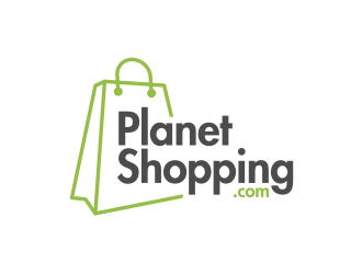
Which logo is better for a global e-commerce platform?
People
50
Choice Option
2
Audience
General
Status
Completed
Location
UNITED STATES
Download
Share
Winner
Option A
70 %
Option B
29 %
Responses
Showing 55/50 responses
Male
Female
All Filters
Gender (Personal)
Male (40)
Female (15)
Age Range (Personal)
18-24 (8)
25-34 (17)
35-44 (25)
45-54 (3)
55-64 (1)
65-74 (1)
Public
03 Jun 2021
39 Responses to Option A
39 people chose A as their choice
1.
I like the globe instead of the letter.
2.
MY OPINION
3.
This option is more creative, attractive visually and unique.
4.
I like the one with the planet in it since it fits well and looks unique.
5.
the design is better
8.
It is good
9.
I chose it for the planet in the O letter. It's really great!
10.
i like the little planet in the shopping. i think makes it stand out
11.
The world as the letter is very clever for this name.
14.
its looking good and admire
17.
Nice picture of the globe shows you where all they can service well.
19.
I like that planet earth is in place of the O, making it more interesting to look at than the second.
20.
the logo is nice
21.
I liked the planet as the O
22.
has the icon of the world which makes you understand that it is global.
23.
good shoping.com
24.
I like this logo
25.
The Earth logo makes it look more appealing in terms design, it sorts of adds a touch to the final design.
26.
Because the globe icon in the middle is unique and represents "global"
27.
GOOD
28.
GOOD
30.
this logo is very nice and letter are very nice
31.
This has the globe in the text which makes it more interesting and less generic than the other one.
32.
It was innovative.
33.
IT IS VERY ATTRACTIVE
35.
This logo design was good. and then, i think, 'O' indicates the world.
37.
I like how it incorporates a small planet into the name of the brand.
38.
this logo is very nice and letters are very nice
39.
It was innovative.
42.
This logo is good
43.
the logo is good
44.
I feel that the globe on the design really helps push the idea of planet shopping.
45.
different letter O (world) good creativity !
46.
I think the O as a planet really adds depth and creativity.
48.
something new in the logo
50.
This looks more fun and well thought out.
52.
ITS MORE ATTRACTIVE
53.
LOOKING GOOD
55.
The logo is looking different.
16 Responses to Option B
16 people chose B as their choice
6.
It has a clear and concise typefont, it looks professional and clean. The first one seems kind of tacky with the globe.
7.
THAT IS GOOD QUALITY
12.
best design
13.
it is high quality
15.
IT IS VERY ATTRACTIVE
16.
It's simpler and cleaner. It looks less cluttered and more professional.
18.
I think the globe is kind of distracting, I like it nice and bold without it.
29.
mostly used this platform
34.
very nice product
36.
looking cool
40.
it is more appealing
41.
it is more appealing
47.
I had to look twice to read the logo for option 1. Option 2 is slightly easier to read
49.
its very nice
51.
It is more vibrant and eye catching over option one
54.
The globe distracts from the name rather than showing it clearly.
Demographics
Manage pending orders and track invoices.
Gender (Personal)
Age Range (Personal)
Share Your Results
×
Anyone with the following URL can see these poll results.
Copy